I designed an app that allows parents to easily buy and resell quality children’s clothing, making it affordable and convenient to give clothes a second life
The key features included:
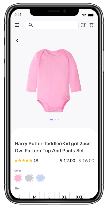
✦ Smart Filters – Allow parents to search for clothes by size, brand, condition, and price. It also suggests fair resale prices based on condition and market trends.
✦ Bundle Options – Enable parents to sell or purchase multiple items together, saving time and shipping expenses.
✦ Personalized Recommendations – Suggests relevant clothing items based on the child’s size and previous purchases.
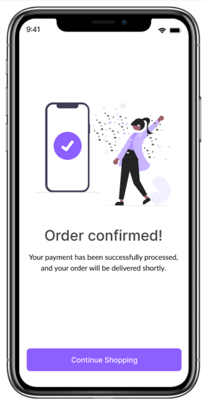
✦ One-Tap Checkout – Simplifies the buying process with secure payment options.
Understanding the Problem:
“I conducted interviews with parents to understand their challenges, needs, and pain points.”
✦ Kids grow fast, leaving many clothes unused.
✦ I have so many clothes my kids outgrow so quickly
✦ Selling old clothes is time-consuming and often requires multiple apps or platforms.
✦ Parents care about the environment and want to reduce waste. These insights helped me focus on creating a solution that was quick, affordable, and eco-friendly.
The Challenge:
My aim was to design an app simplifying parents’ lives. The problem was clear: parents were struggling with the cost of children’s clothing, the hassle of selling outgrown clothes, and the environmental impact of throwing away good clothes. They needed a solution that was simple, affordable, and eco-friendly.
Goal:
My goal was to design an app where parents could buy and sell children’s clothes easily. The app had to save them time, reduce costs, and promote sustainability. But most importantly, it had to be simple and user-friendly—because parents are busy and don’t have time for complicated processes.
Designing for Simplicity:
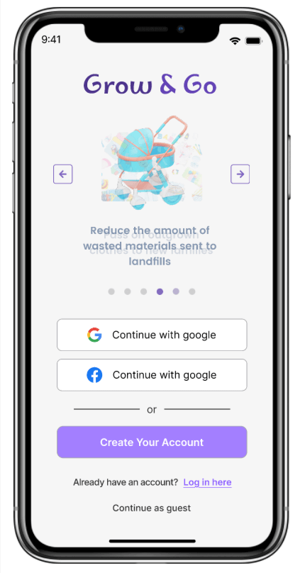
Simplified Onboarding: I reduced the number of steps required to list an item, making it faster for parents to start selling children’s clothes.
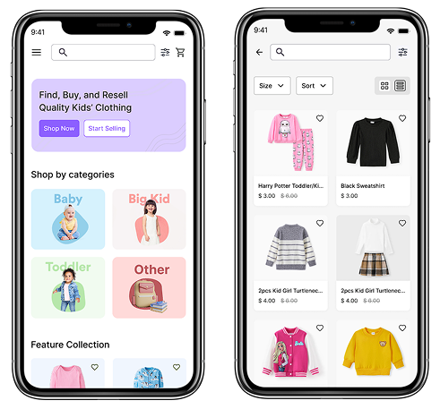
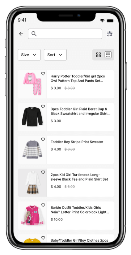
Streamlined Search & Filter System: I introduced an efficient search and filter system that allows users to quickly find clothes based on size, brand, condition, and price, improving the shopping experience.
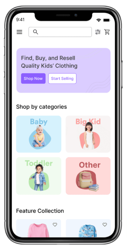
Simple Navigation: I designed a clean, intuitive interface with clear buttons and menus, ensuring parents can find what they need in just a few taps.
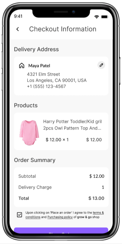
Quick Listing: Selling clothes is as easy as taking a photo and adding a few details. I ensured the process was fast and hassle-free.
Smart Filters: To help parents find what they’re looking for, I added filters for size, price, and style, making browsing quicker and more efficient.
Eco-Friendly Focus: I incorporated features that highlight the environmental benefits of buying and selling used clothes, resonating with parents who care about sustainability.
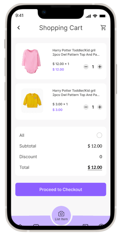
before usability testing:
Add Your Tooltip Text Here
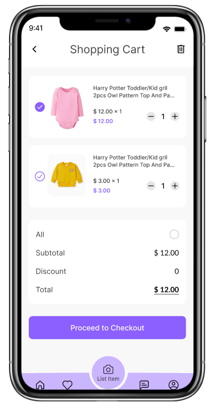
After usability testing
Testing and Improving:
I didn’t just design the app and call it done. I tested it with real parents to see how it worked for them. Here’s what I did:
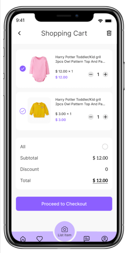
Cart Issues: Parents had trouble adjusting the number of items in their cart. I fixed this by adding a multi-select feature so they could easily remove multiple items at once.
Navigation Confusion: Some parents weren’t sure which page they were on. I added visual indicators to make it clear where they were in the app.
Search and Filtering: Parents wanted more control over how they searched for clothes. I added sorting options and the ability to switch between grid and list views. These changes made the app even more user-friendly and efficient.
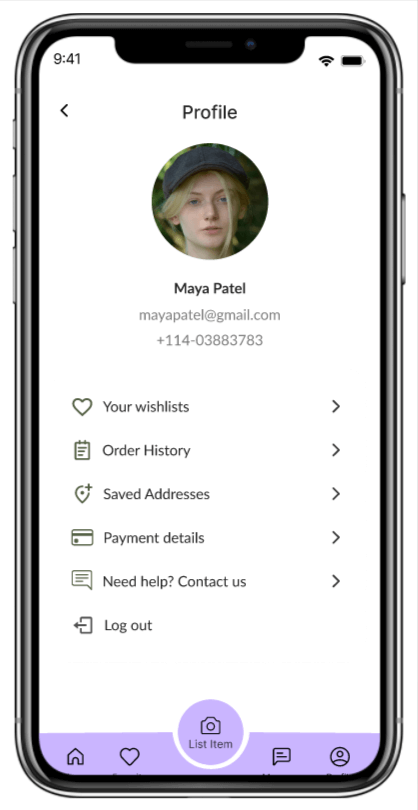
Making It Accessible:
I ensured the app is accessible to all, including parents with visual impairments or other disabilities
Clear Visual Hierarchy: I used consistent fonts and headings to make the app easy to navigate.
Color Contrast: I followed accessibility guidelines to ensure text and buttons were easy to read.
Alt Text for Images: I added descriptions for all images so screen readers could explain them to users who couldn’t see them.
What I Learned:
This project taught me the importance of listening to users and designing with empathy. Even small changes, like adding a visual indicator or simplifying a process, can make a big difference. By focusing on real user needs, I created a solution that truly helped parents.
Final Thoughts:
Designing this app was a rewarding experience. It reinforced the importance of user-centered design in solving real-world problems and making daily tasks easier for parents.
Through this project, I honed my skills in user research, interaction design, and usability testing. More importantly, I learned how small design decisions—like simplifying the listing process and ensuring trust between users—can create a big impact.
This project has strengthened my approach to designing with empathy, and I look forward to applying these insights to future projects.
Next Steps
While this project successfully addressed key user needs, I see opportunities for further improvements. Future iterations could explore enhanced AI-based recommendations, expanded accessibility features, and a more personalized user experience.
Let's Connect!
I’m always excited to collaborate on meaningful UX projects. If you’d like to discuss UX design, user research, or potential opportunities, feel free to reach out.
Interested in more of my UX work? Check out my other case studies here!”
Explore my design process behind this case study. View the Figma slides for a step-by-step breakdown or download the full case study for a detailed overview