A coffee shop selling premium coffee beans and online coffee kits needed a modern, responsive website to enhance customer experience and increase sales."
Role: Sole UX/UI Designer
Project Type: Responsive Ecommerce Website
Tools: Figma, Figjam, Docs
Project Duration: (6 weeks)
🔗 View the figma hi-fidelity prototype all devices:
I followed this method to complete the case study. To dive deeper into the complete process behind the design, you can explore the full details by clicking on the Figma slide deckor the full case study download.
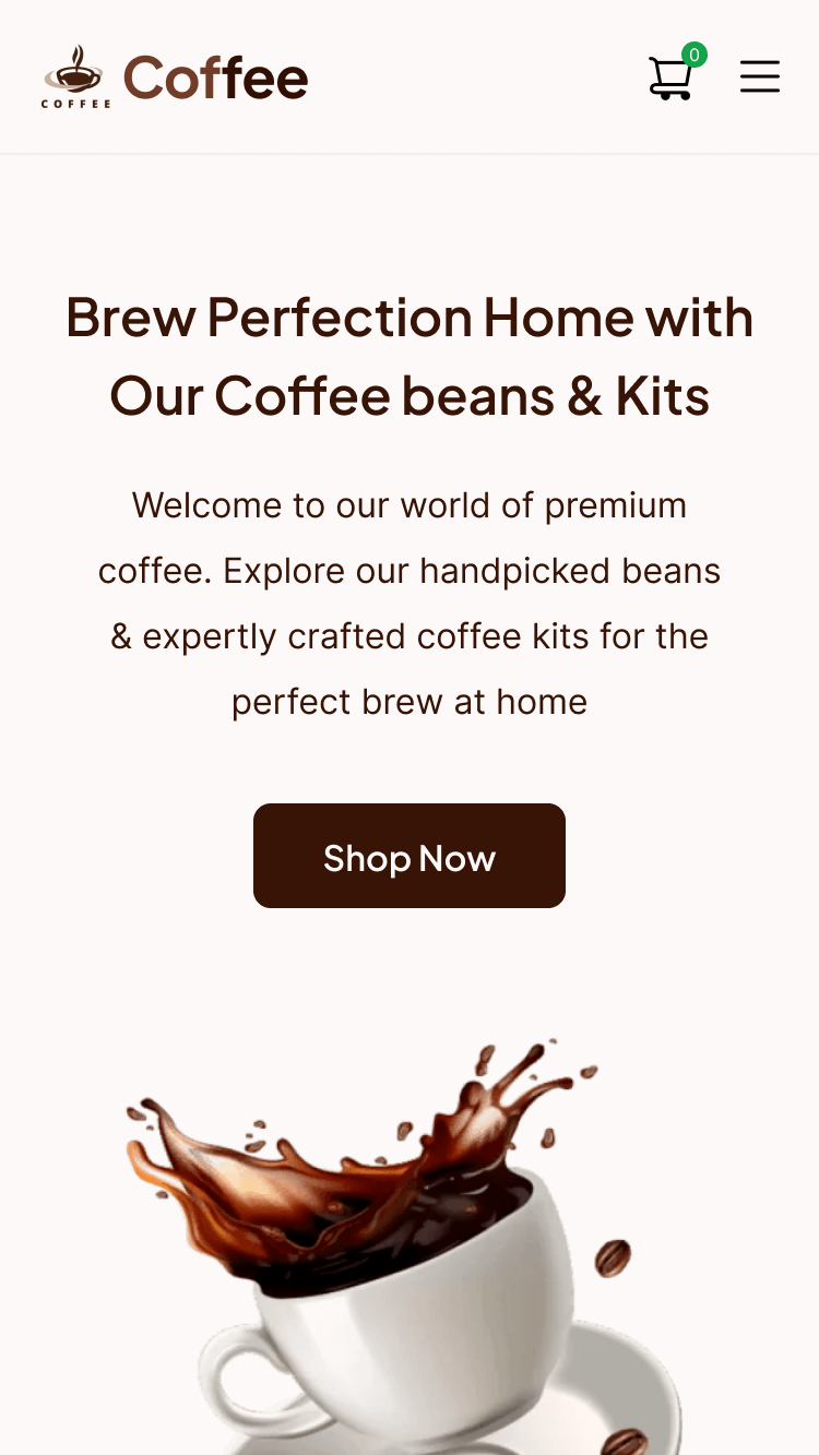
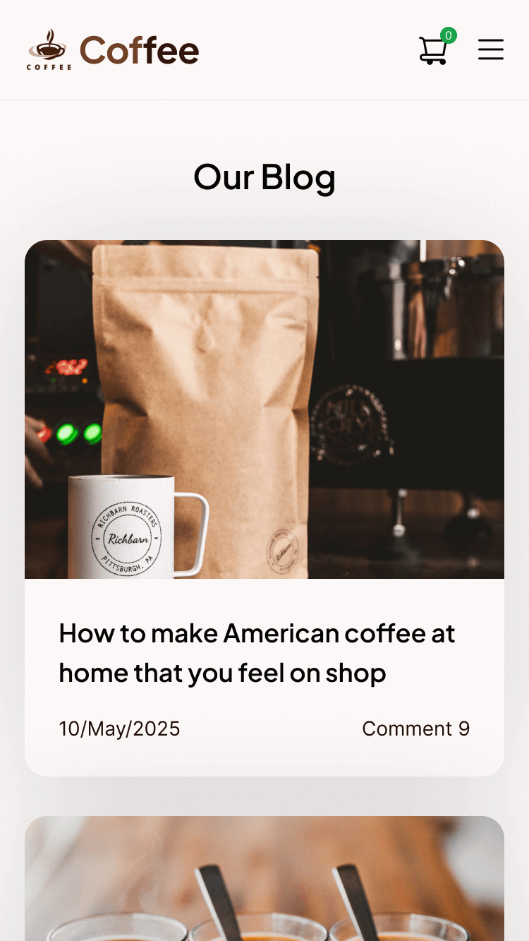
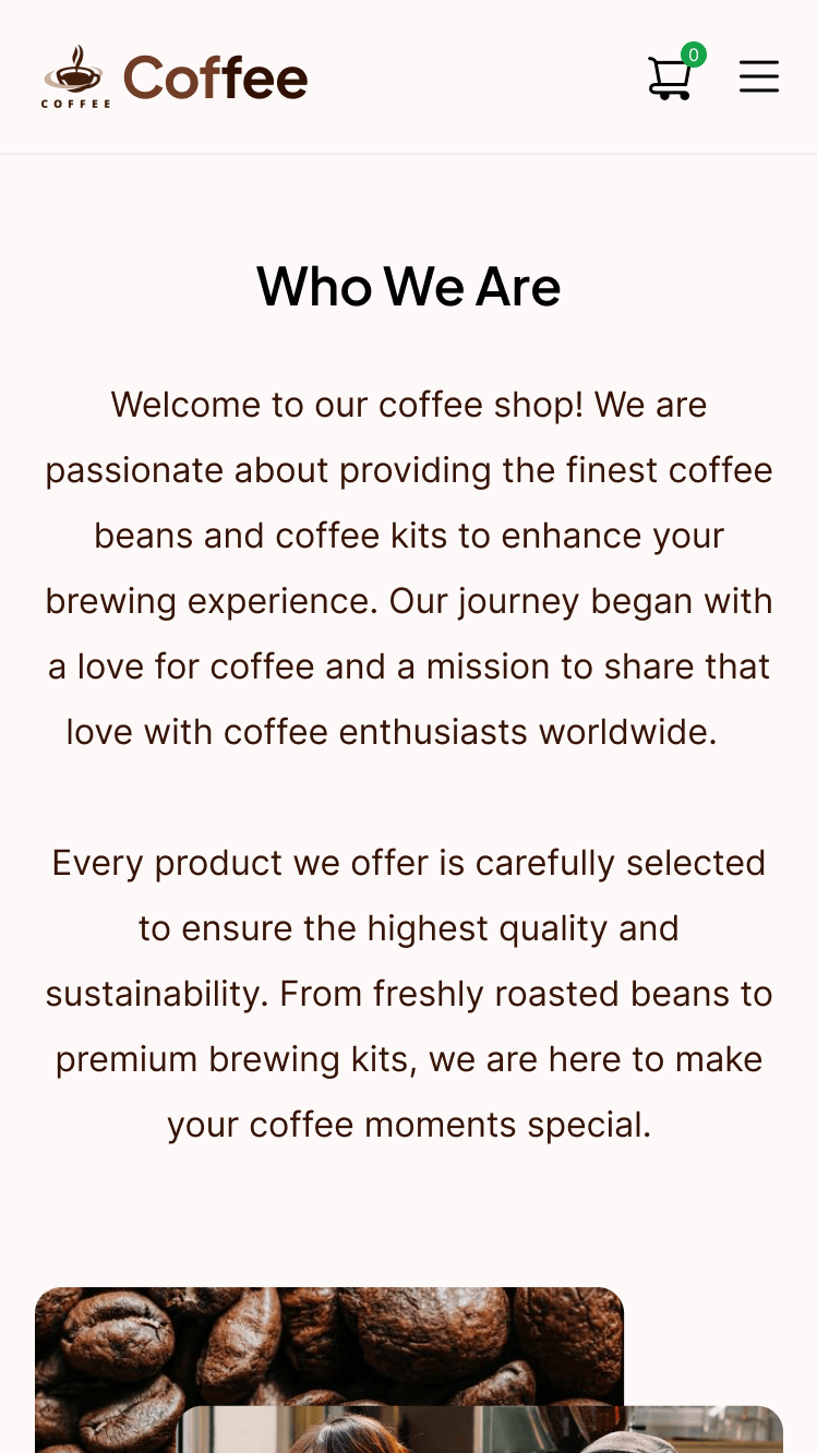
☕ Project Overview:
This e-commerce website, designed in 2025, aims to provide a seamless shopping experience for coffee lovers. The website offers a carefully curated selection of premium coffee beans and brewing kits, making it easier for user to explore, compare, and purchase products.
Problem:
Several pain points were identified through user research and competitor analysis:
I conducted interviews with 5 coffee enthusiasts and surveyed 50 online shoppers to understand their pain points when buying coffee online. This research revealed that users often feel overwhelmed by too many choices and struggle to find quality coffee beans and brewing kits in one place
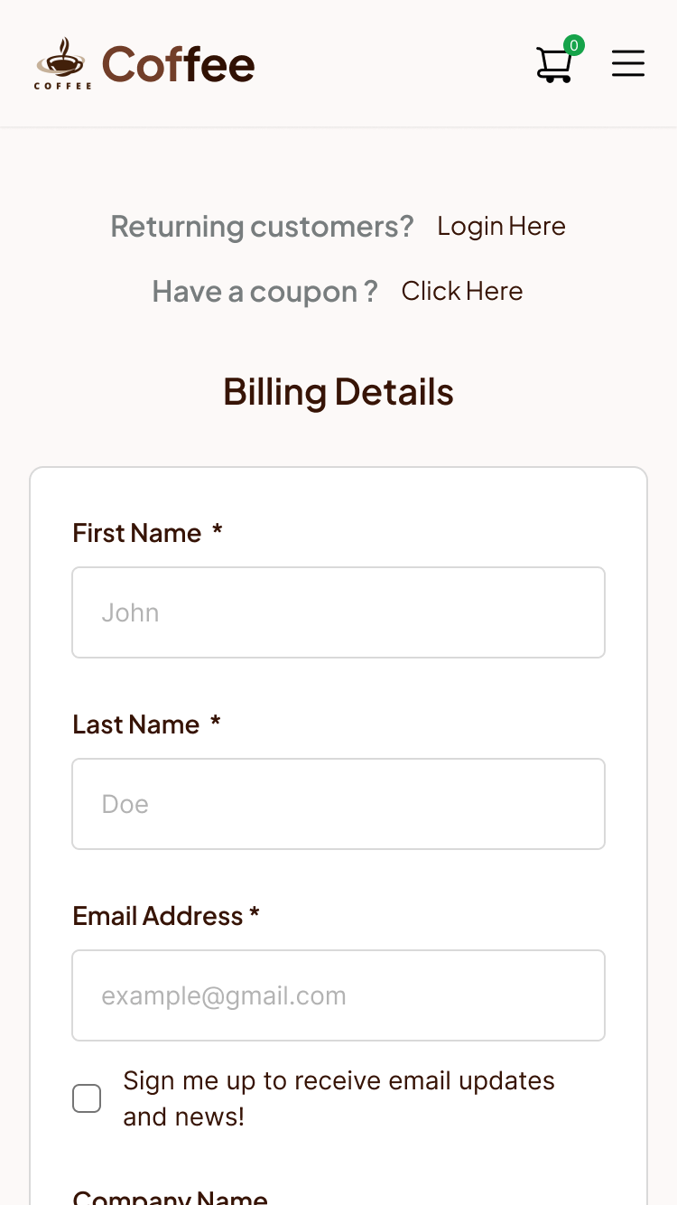
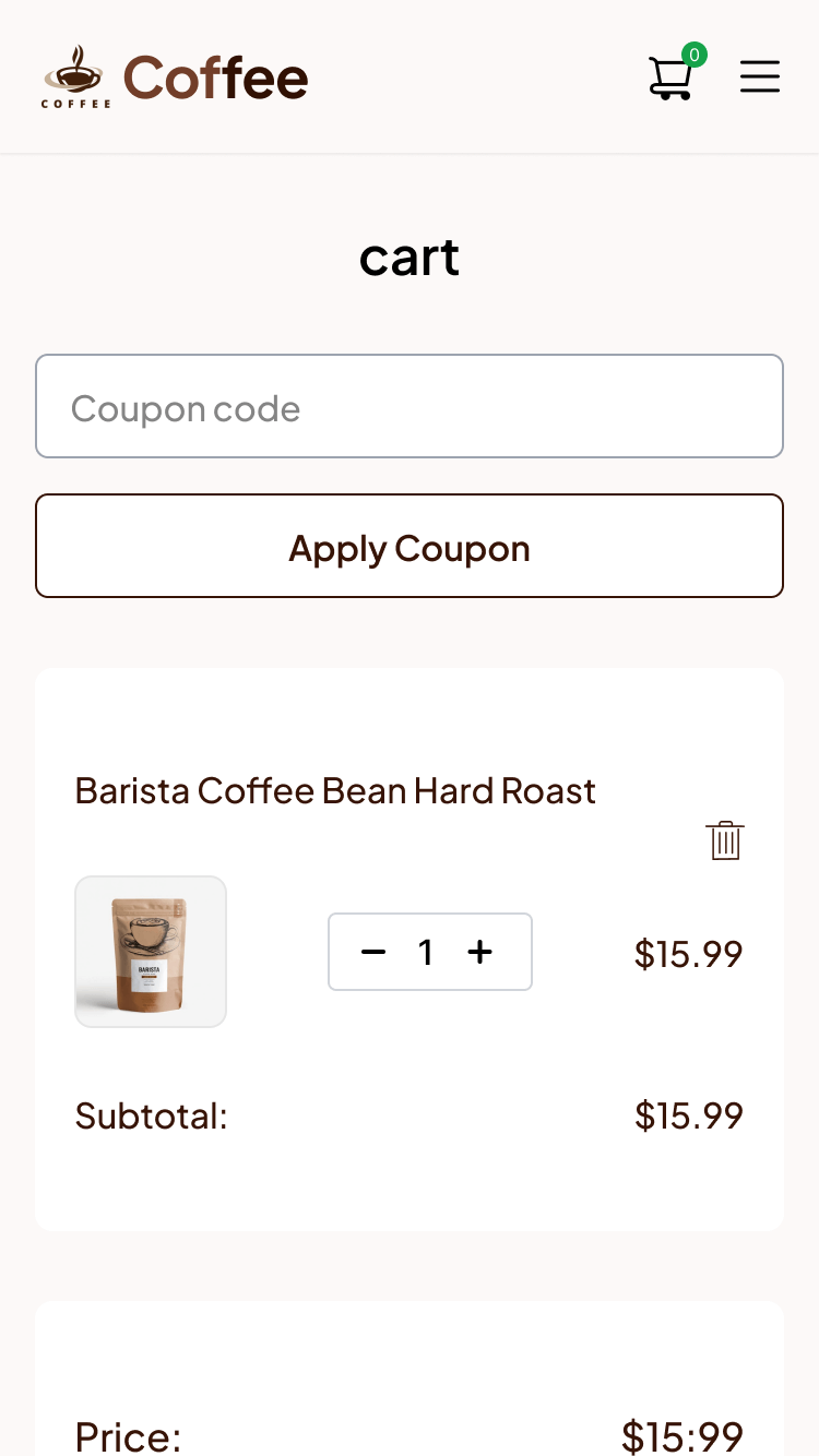
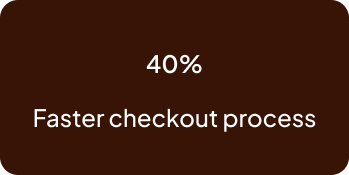
After analyzing three major competitors, I found that their checkout processes were overly complex, with an average of 5 steps compared to our streamlined 3-step process. This insight helped me focus on simplifying the user journey.
✦ Users struggle to find quality coffee beans & brewing kits in one place.
✦ Many users feel overwhelmed by the number of choices in online stores.
✦ Checkout processes in existing e-commerce platforms are lengthy and complicated.
Challenge:
Here are some key challenges:
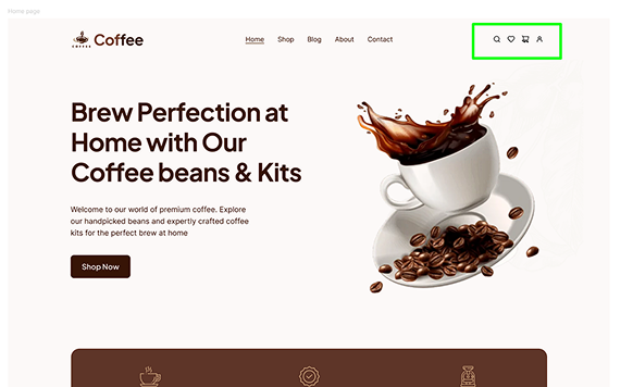
✦ Creating a user-friendly navigation that simplifies product discovery.
✦ Balancing aesthetic appeal with functionality in the UI design.
✦ Ensuring a fast and smooth checkout experience to reduce cart abandonment.
My Workflow
Designing this online coffee shop involved several key steps from a UX and visual interface perspective. I began by understanding user needs what they look for when buying coffee online. Through user research, I discovered that 60% of participants felt overwhelmed by the sheer number of coffee options, while 40% were frustrated with a complicated checkout process. This insight guided me to create a simpler product filtering system and a streamlined, three-step checkout.
To address these challenges, I crafted an intuitive navigation structure with clear product categories and easy-to-follow guides for beginners. Since over 70% of users do their shopping on mobile devices, I prioritized mobile responsiveness in my designs to ensure quick loading times and effortless browsing.
Throughout the design process, I applied UX best practices to keep the site visually appealing, easy to navigate, and user-focused
As the sole UX and UI designer, I embraced a mobile-first approach, creating wireframes, prototypes, and the final visual design before scaling up to desktop. This strategy helped me address the most critical pain points early on.
I focused on creating a simple and engaging shopping experience. I designed an intuitive navigation system, clear product categories, and a seamless checkout process to reduce friction.
By applying UX best practices, I made the design visually appealing, easy to use, and trustworthy, helping coffee lovers confidently make their purchase decisions.
Design style guide:
I chosen color palette reflects the brand’s warm and elegant identity, making the design visually appealing and user-friendly. I ensured the website met WCAG 2.1 accessibility standards by using high-contrast colors, providing alt text for all images, and testing with screen readers. This made the website usable for everyone, including people with disabilities.
The color palette was tested for accessibility, ensuring a contrast ratio of at least 4.5:1 for text and background colors. This made the website readable for users with visual impairments.
Testing and Feedback
I tested it with real users. After usability testing i changed few things icon and search bar. Their feedback helped me identify areas for improvement.
Before usability test:
Observation 🔹 Users had trouble finding search & cart icons in the header.
Problems Identified: 🔹 Unclear icons—Users struggled to locate key features.
🔹Faster navigation—Users found search & cart functions easily.
🔹Positive feedback—Users loved the clearer search bar!
The outcomes:
After usability testing. i analyzed feedback and made improvements. here are the key results:
Final Thoughts
This project taught me the importance of staying updated with UX trends while keeping the user at the center of the design process. By focusing on simplicity, personalization, and sustainability, I was able to create a website that not only solved the coffee shop’s problems but also enhanced the overall user experience.
I believe UX design will continue to evolve, and I’m excited to keep learning and adapting to create even better experiences for users.
I’m always excited to collaborate on meaningful UX projects. If you’d like to discuss UX design, user research, or potential opportunities, feel free to reach out.
Interested in more of my UX work? Check out my other case studies here!”